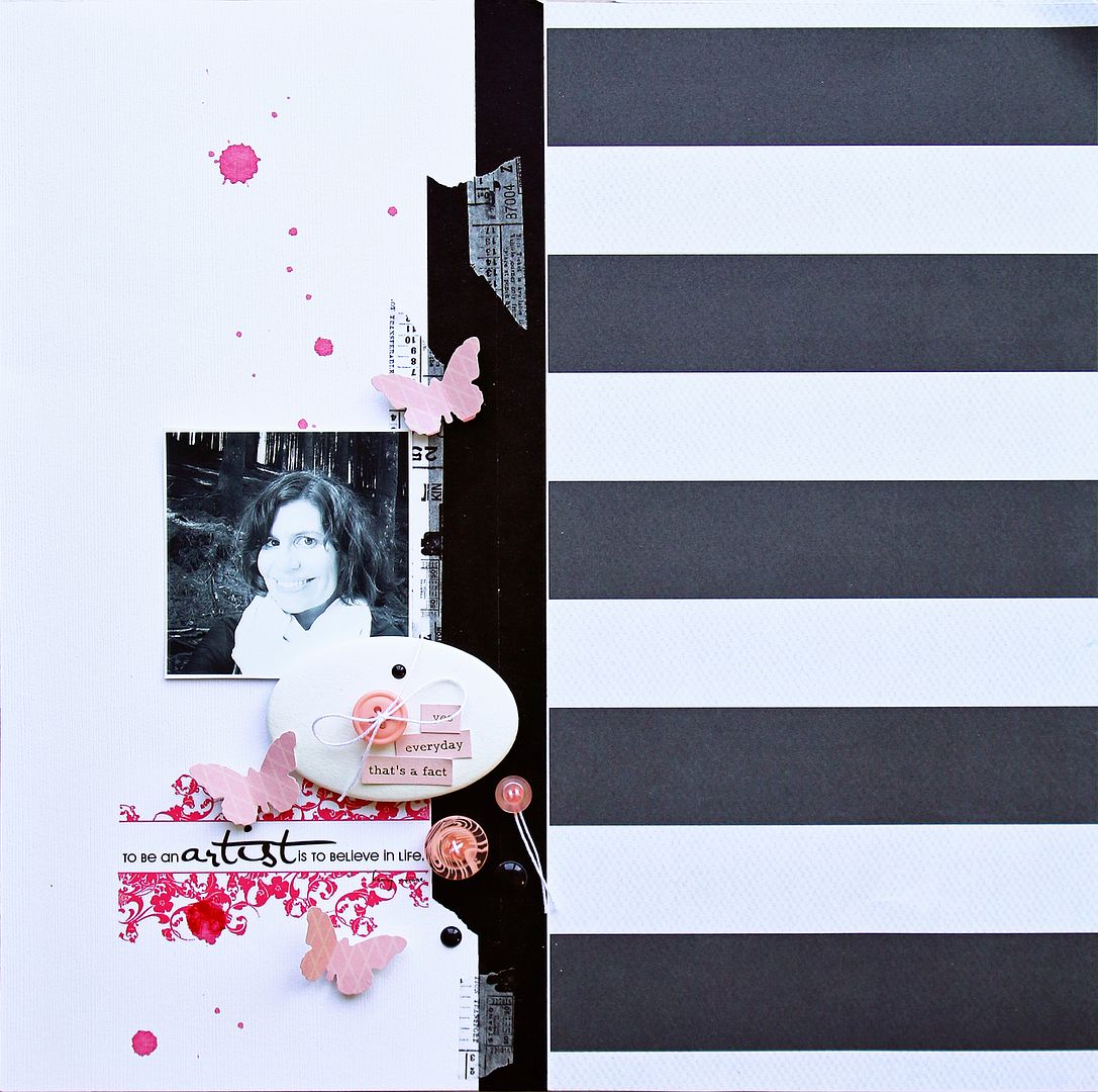
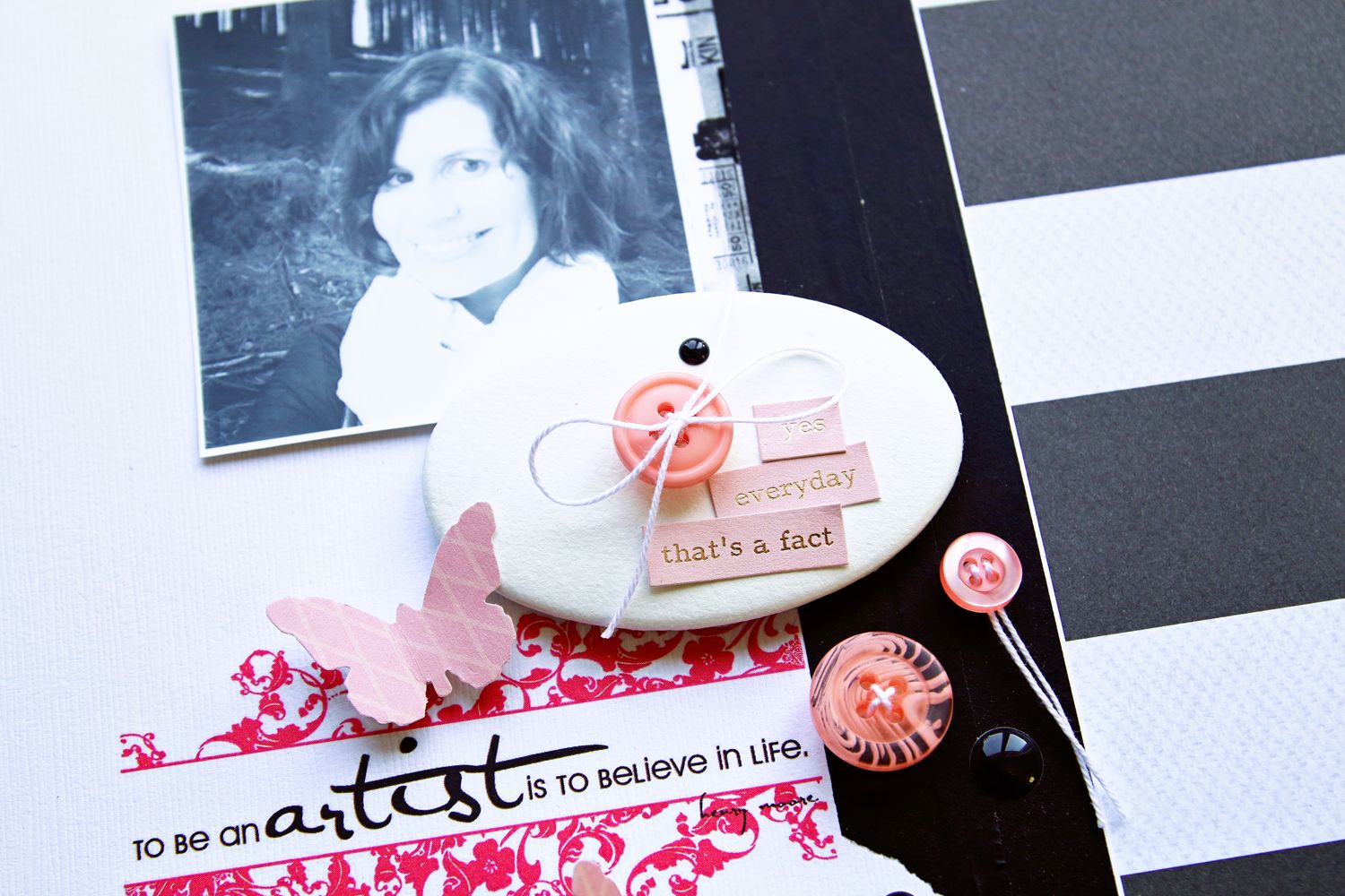
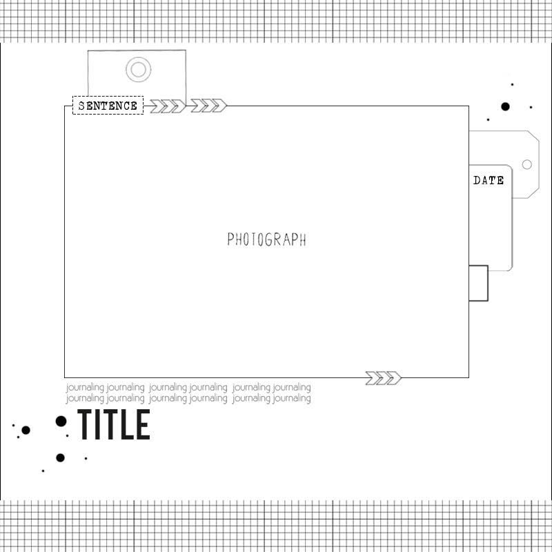
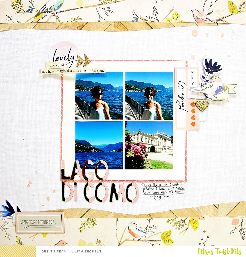
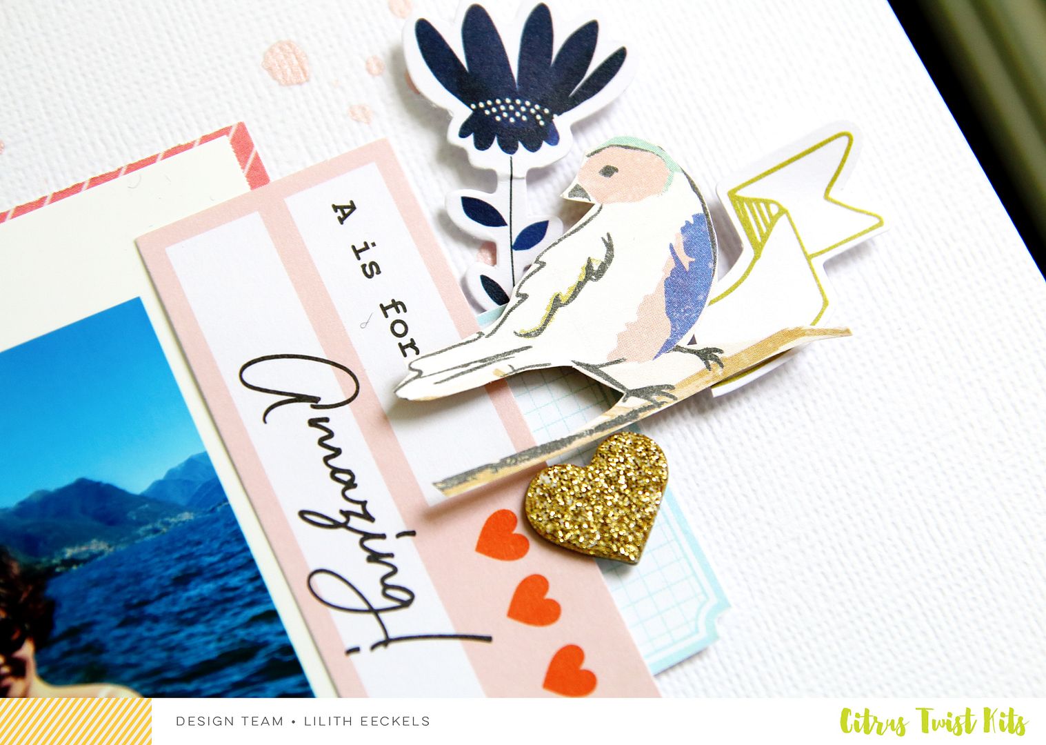
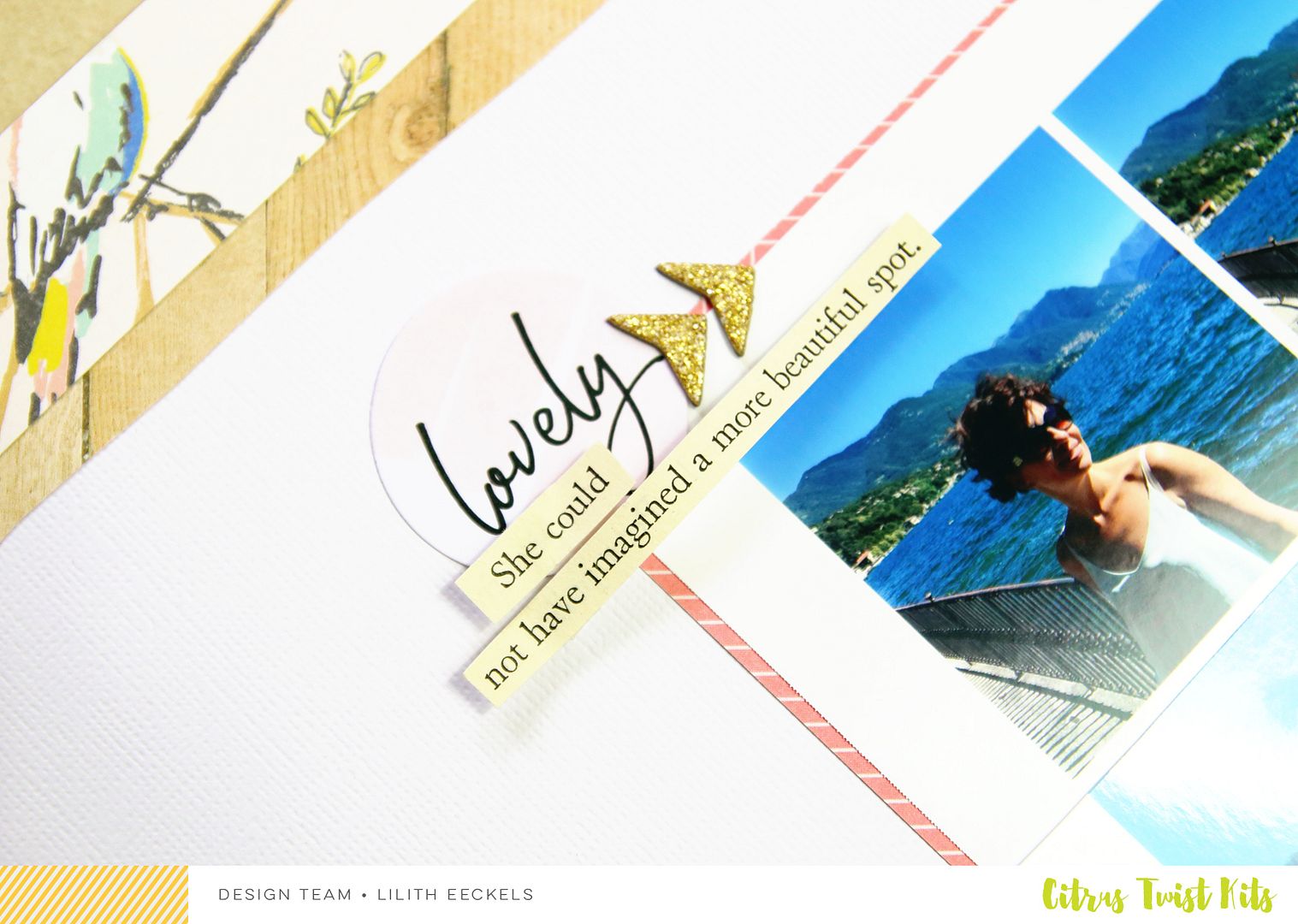
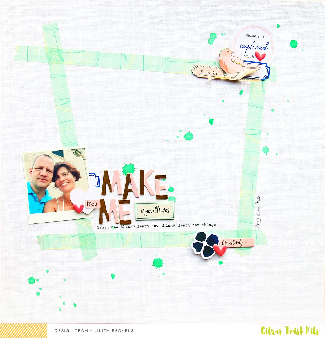
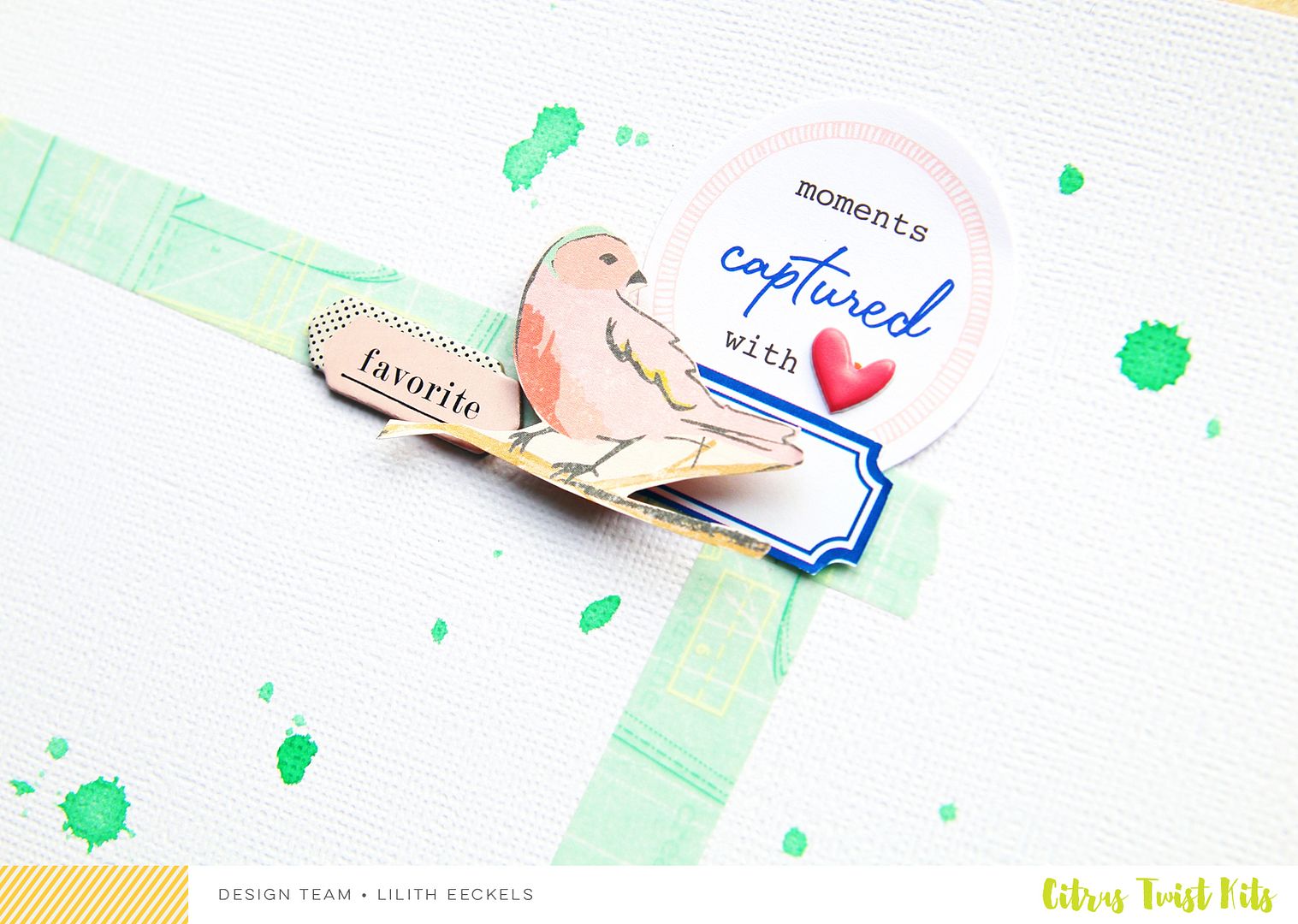
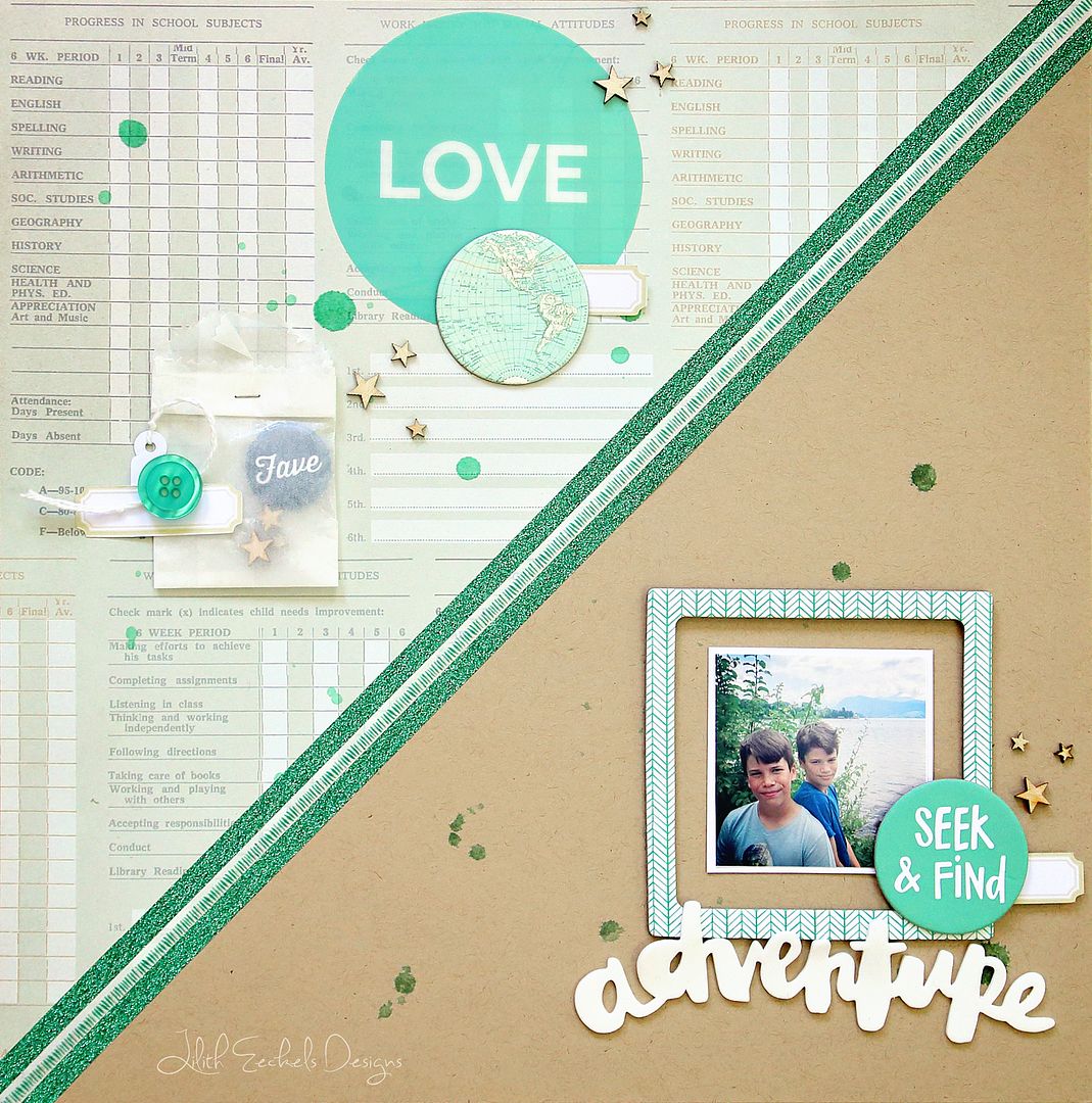
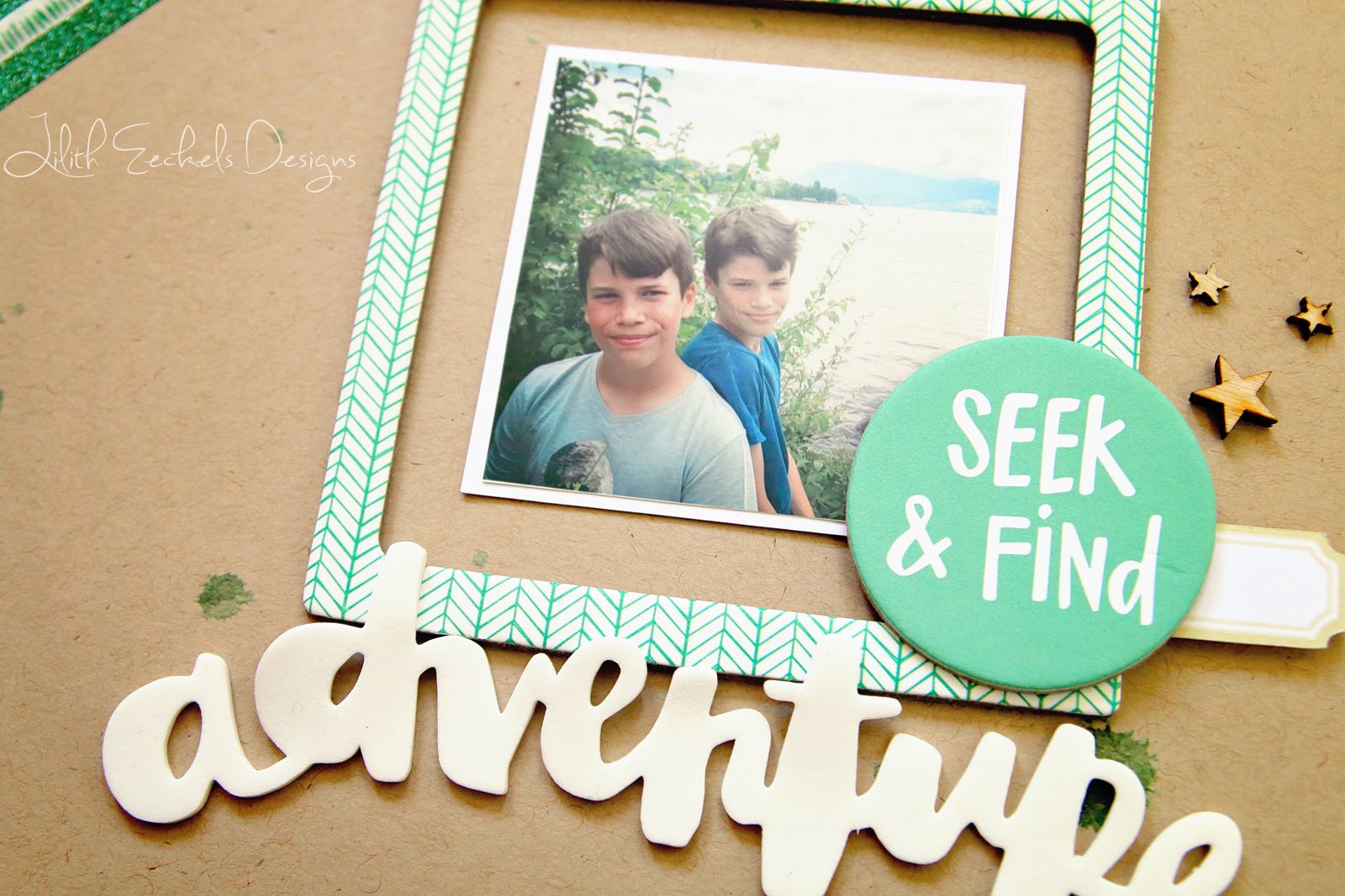
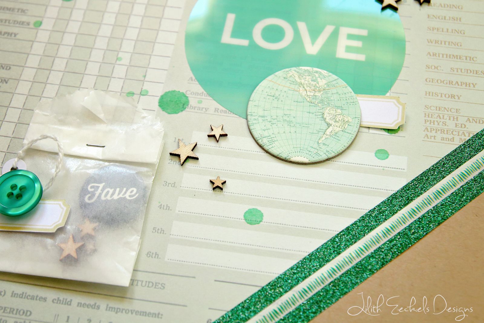
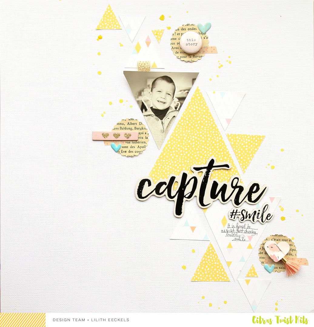
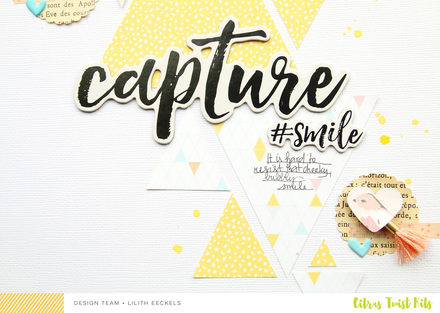
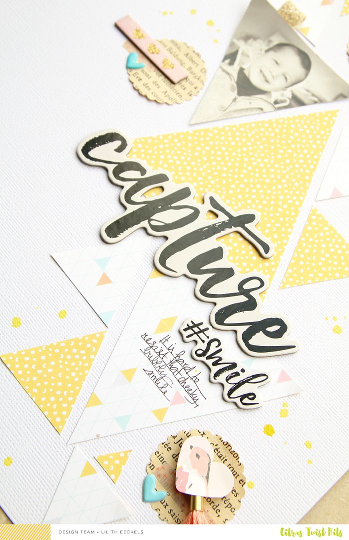
In my previous post I talked about an article that I had written for Esprit Scrapbooking. The theme was halves and this layout is a second interpretation of it. Here I opted to use half of the page but I divided the page diagonally. I was a bit afraid that there would be too much white space but it looks so pleasing to the eye. I used scraps from older Dear Lizzy lines. I loved those polaroid frames.
I be back soon to share some DT work. Have a great weekend.
Happy Scrapping.


