In the mean while ...

5 April 2016

While I'm waiting for my video to upload (still need to tweak it a little) I'm going to share two more layouts that I created.
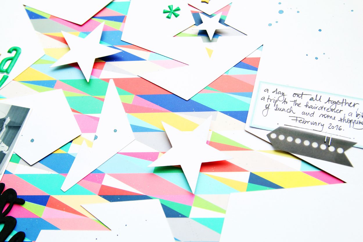
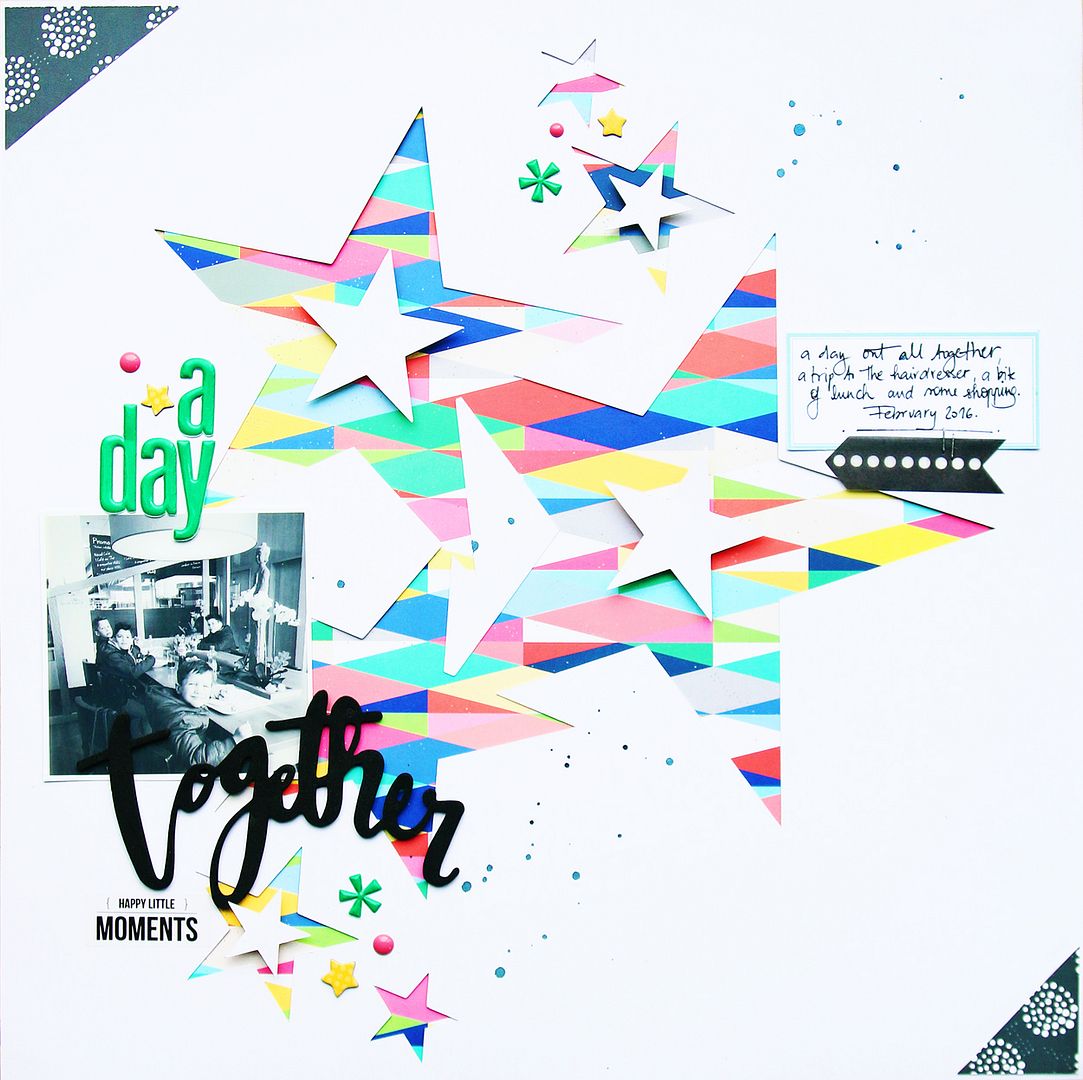
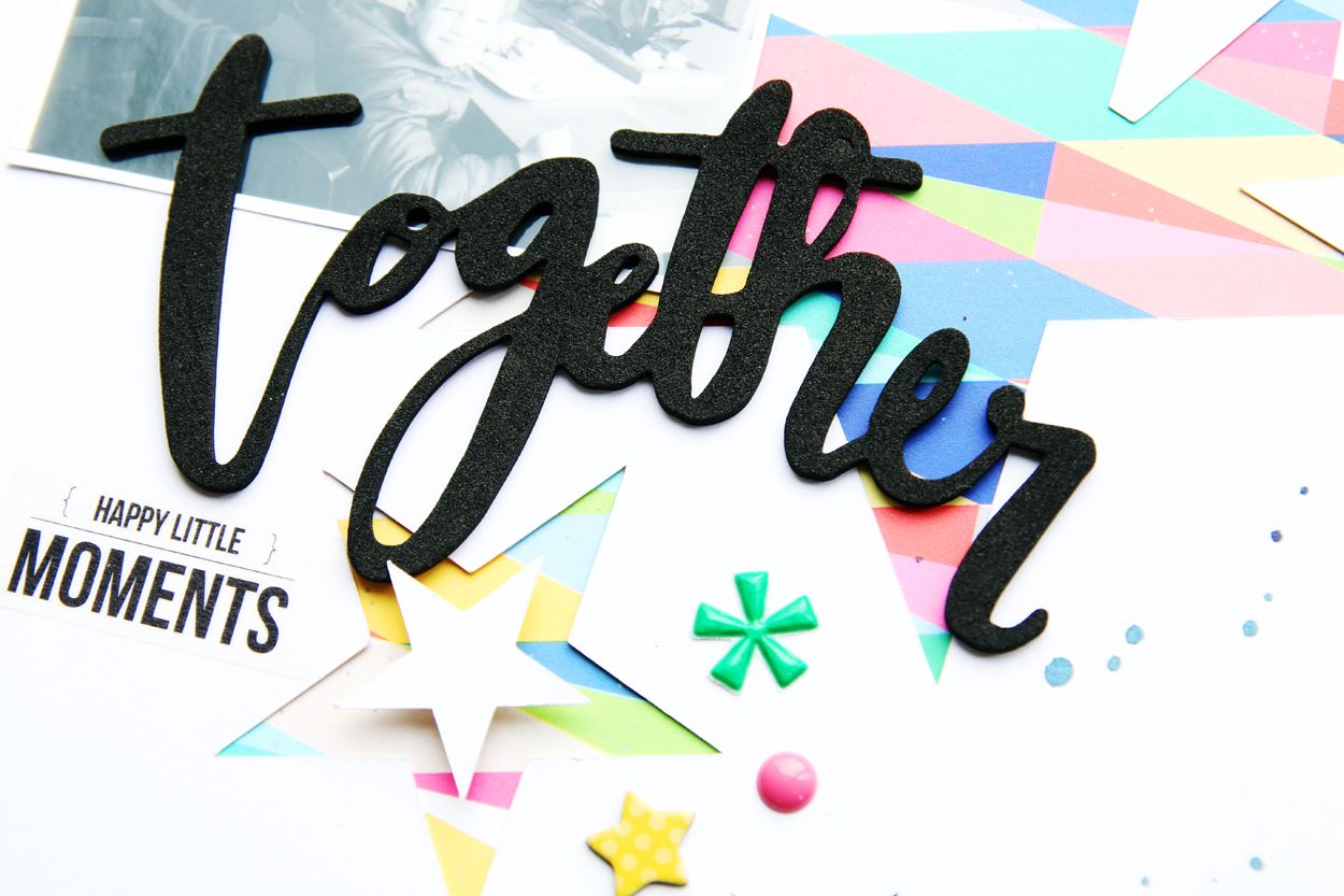
For the first one I created a star cut file and used some funky colourful paper beneath. I kept the embellishments simple and didn't want to add too many layers. That way the photo and the cut are the centre piece of the layout.


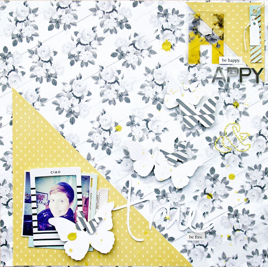
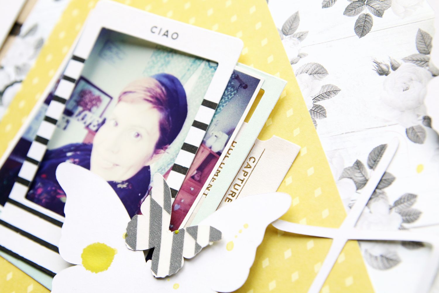
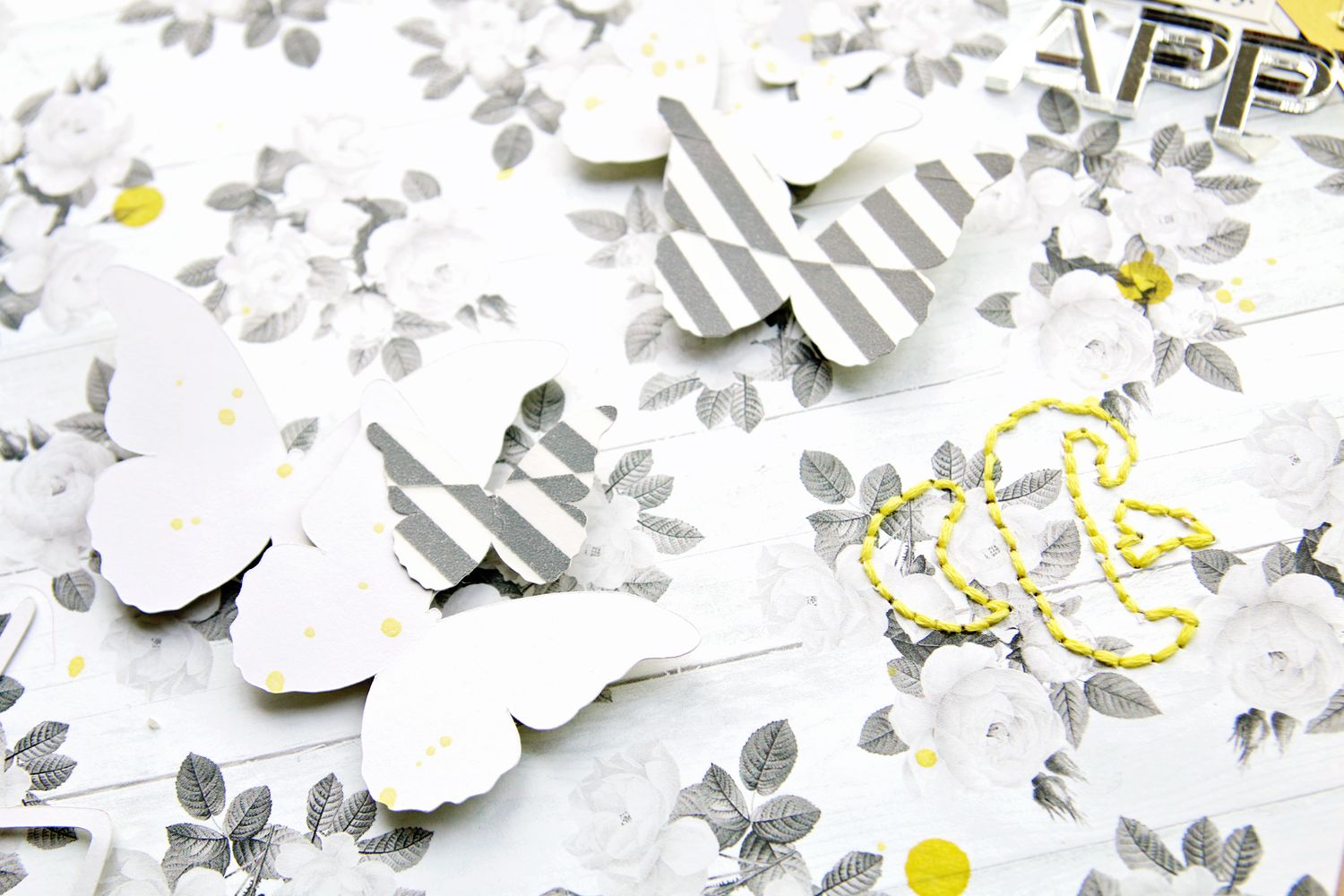
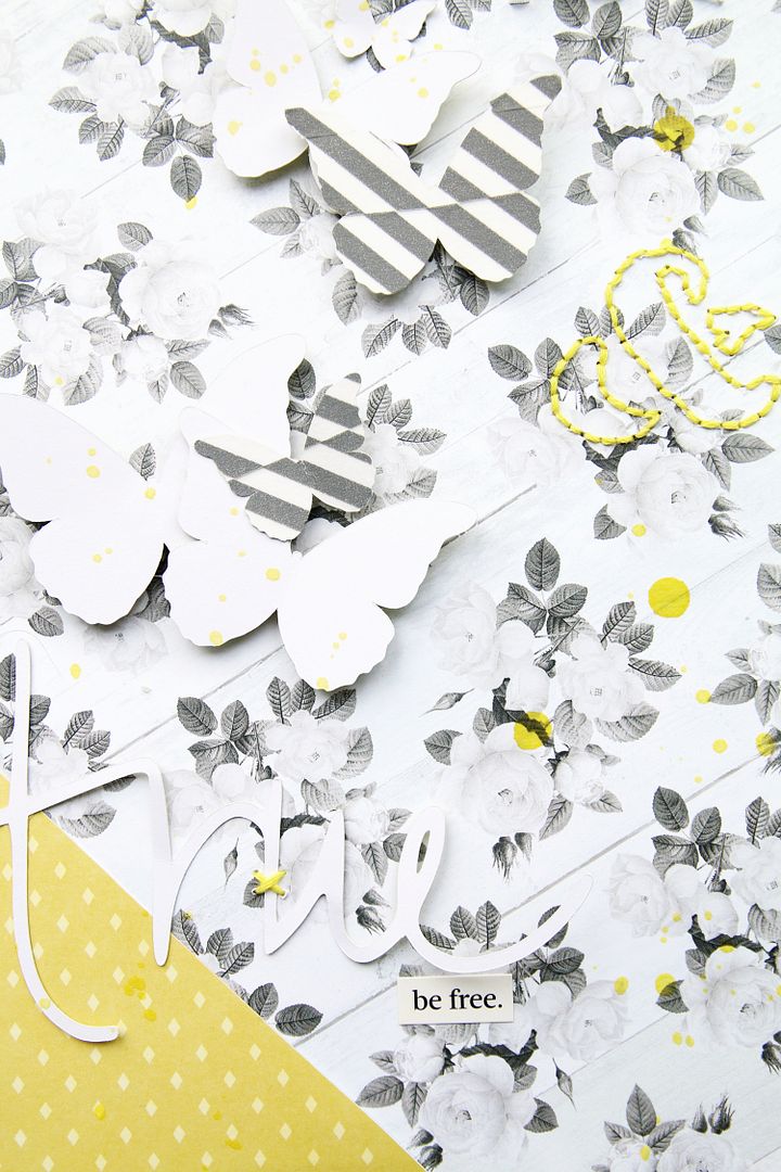
The second layout was one I created for the hipkit DT call. I went with a yellow and grey colour scheme with a main element with a photo in the bottom left hand corner and a smaller duplicate with the title in the top right hand corner. This creates flow and balances out the page. The scattered butterflies guide the eye over the layout. Some of the butterflies are covered in washi tape to add a bit of detail as does a little bit of stitching. 


Both layouts were created from older stash and kits from the HipKitclub. I have decided to stop my subscription which makes me sad but I have some plans for home improvements and need to save a little. I might buy one or two collections but I really need to work through my stash.
See you later today or tomorrow with a little video.
No comments :

Theme by: Pish and Posh Designs